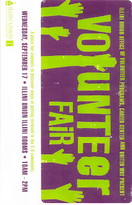
The Image that I selected this week was for a volunteer fair the Illini Union hosted a couple of weeks ago. I thought this was a great poster/flyer promoting this volunteer fair. I love the use of color that is presented. The purple and green is really eye catching. The green is loud and bold and stands out when you look at a wall full of other signs and flyers. The purple is a dark color that focus your eyes to what the green writing is saying. The font is also GREAT! The font is simple in that it is a plain font with no funky curves or anything and is BOLD, making the font stand out and look important. The title (Volunteer Fair) is Bold and takes up most of the poster, page and center really catching the attention of the people passing by. Then if someone is interested there is the smaller font that has the important information like the date, time and location. What really makes the poster stand out even with the font, style and colors is the unique use of art. The designer did a great job by interpreting hands into the poster and the layout of the title of the poster. The hands really give the poster an emotional touch to the poster. When you look at the poster you see that there is a volunteer fair but then when you take in the details of the poster you feel the need to volunteer and use your hands to make a difference in someone else’s life!!
Ashley Hummel
No comments:
Post a Comment